MONOÉ
High fashion digital banners featuring unisex streetwear with editorial minimalism.

Project Overview
MONOÉ commissioned us to create a series of digital banners for their high fashion unisex streetwear brand. The creative direction centered on the concept of "fashion as architecture" — emphasizing text and structure over noise, with a focus on clean lines, bold typography, and strong use of whitespace.
Our design approach embraced the brand's minimalist editorial aesthetic, utilizing a predominantly black and white color palette with neutral tones. The visuals highlight the quality of materials — heavy cotton, silk, textured fabrics, and metal zippers — while maintaining a sophisticated, architectural composition.
The campaign banners were designed for various digital platforms, including social media, website headers, and online advertising. Each design maintains the brand's distinctive visual language while adapting to different formats and contexts, ensuring a cohesive brand presence across all touchpoints.
Project Details
Client
MONOÉ
Industry
High Fashion / Streetwear
Services
Digital Banners, Campaign Visuals
Style
Editorial Minimalism
Visual Language
Black & white, neutral tones, clean lines, bold type
Project Gallery
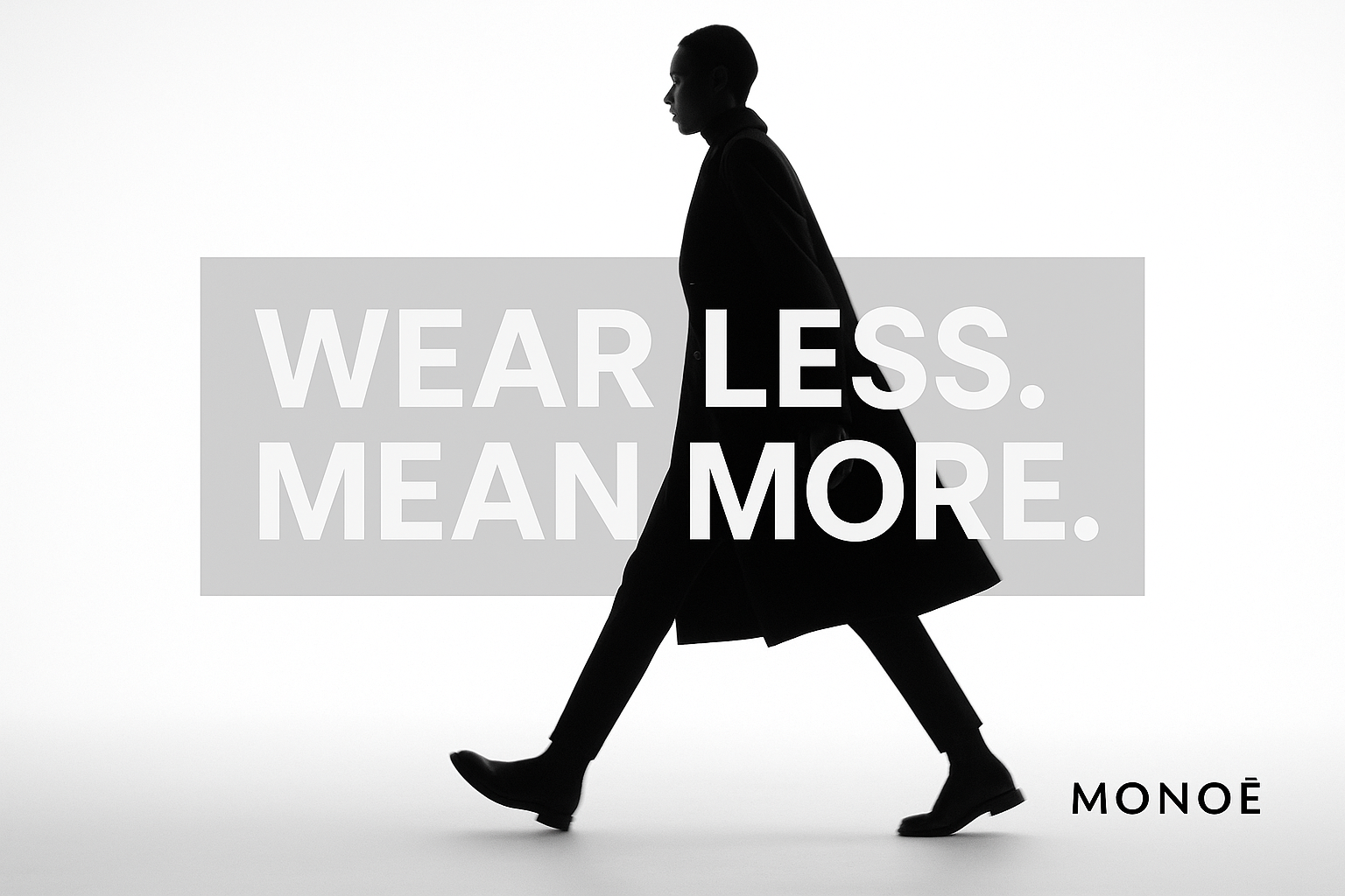
Minimalist Fashion Advertisement
Editorial campaign featuring stark contrasts and architectural silhouettes
Monochrome Fashion Flatlay
Product arrangement highlighting textural elements and material quality
Minimalist Fashion Banner
Digital banner emphasizing negative space and typographic hierarchy

Architectural Fashion Banner
Campaign visual exploring the intersection of fashion and structural form

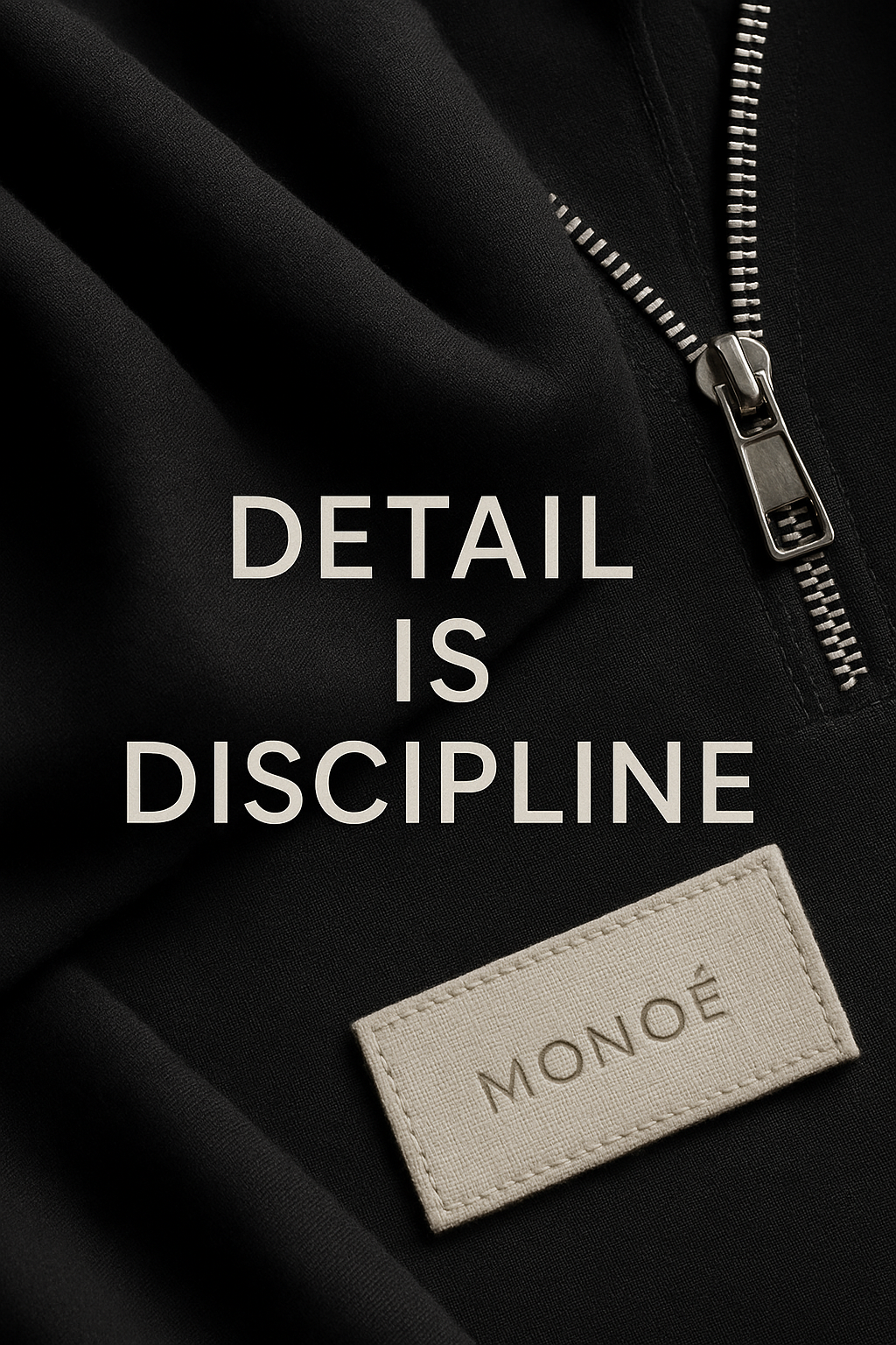
Minimal Jacket Tease
Product spotlight with emphasis on material texture and clean lines

DROP 001 Fashion Spotlight
Collection announcement with bold typography and structural composition
Design Approach
Architectural Composition
We approached each design as an architectural structure, considering balance, proportion, and spatial relationships. Negative space was treated as an active design element rather than background.
Typography as Structure
Bold typography serves as both communication and structural element. We used custom letter spacing and hierarchical arrangements to create visual tension and guide the viewer's eye.
Material Focus
Close-up photography highlights the quality and texture of materials. Lighting techniques emphasize the interplay of light and shadow on fabric surfaces, reinforcing the architectural theme.
Campaign Impact
Brand Positioning
The campaign successfully positioned MONOÉ as a distinctive voice in the crowded fashion landscape. Industry publications noted the brand's "architectural precision" and "refreshing minimalism" in a market often dominated by visual excess.
Audience Engagement
Digital banners achieved a 4.7% click-through rate, significantly above industry average. The campaign resonated particularly strongly with the design-conscious urban demographic, driving a 68% increase in new visitors to the brand's online store.